2024
Medlinx
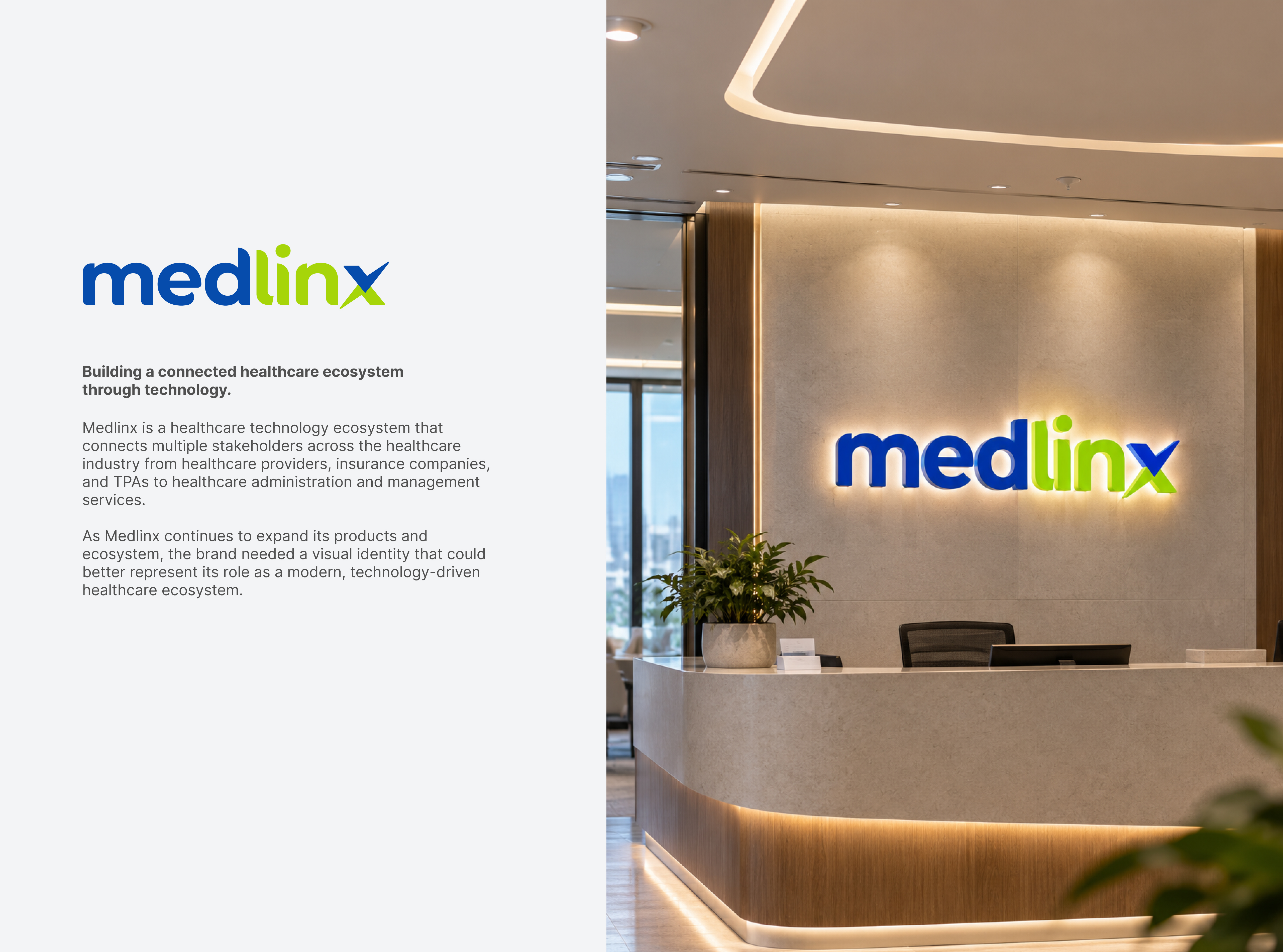
Corporate rebranding for Medlinx (PT Medlinx Asia Teknologi), a healthcare technology ecosystem connecting providers, insurance companies, and TPAs — evolving the identity to better reflect its modern, connected platform.
The Context
A visual identity built to match the scale of a growing healthcare ecosystem.
Medlinx connects multiple stakeholders across the healthcare industry — from providers and insurance companies to TPAs and administration services. As the platform expanded its product suite (izihealth, izidok, iziklaim), the brand needed an identity that felt modern, trustworthy, and technology-forward. The redesign moved from a serif-heavy mark to a clean wordmark with a distinctive "x" connection symbol representing interoperability across the ecosystem.
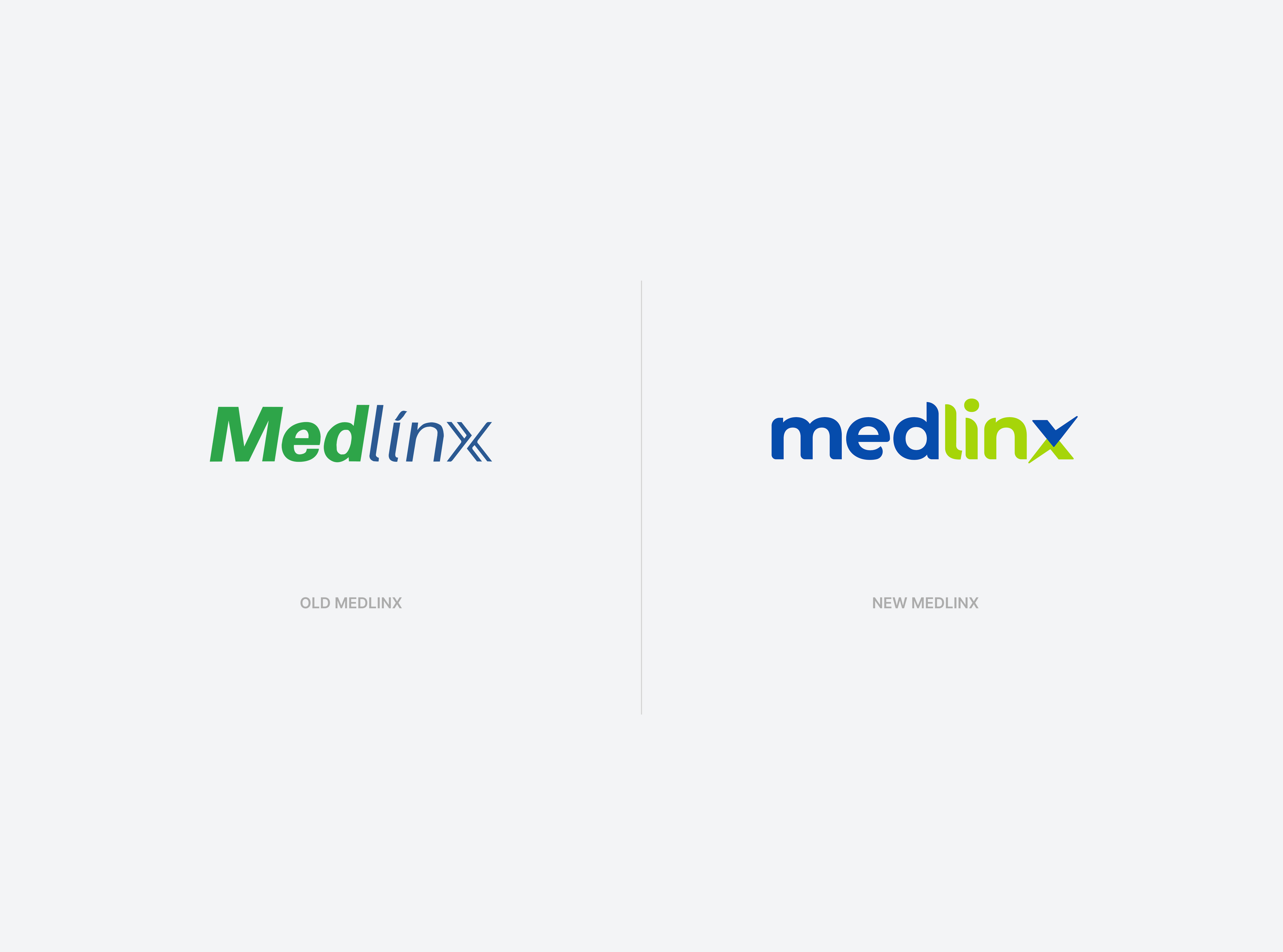
01 — Before & After
The old logo used an italic serif treatment — traditional but static. The new mark adopts a rounded sans-serif wordmark with a dual-tone "x" mark, balancing the warmth of healthcare with the precision of technology.
02 — Logo System
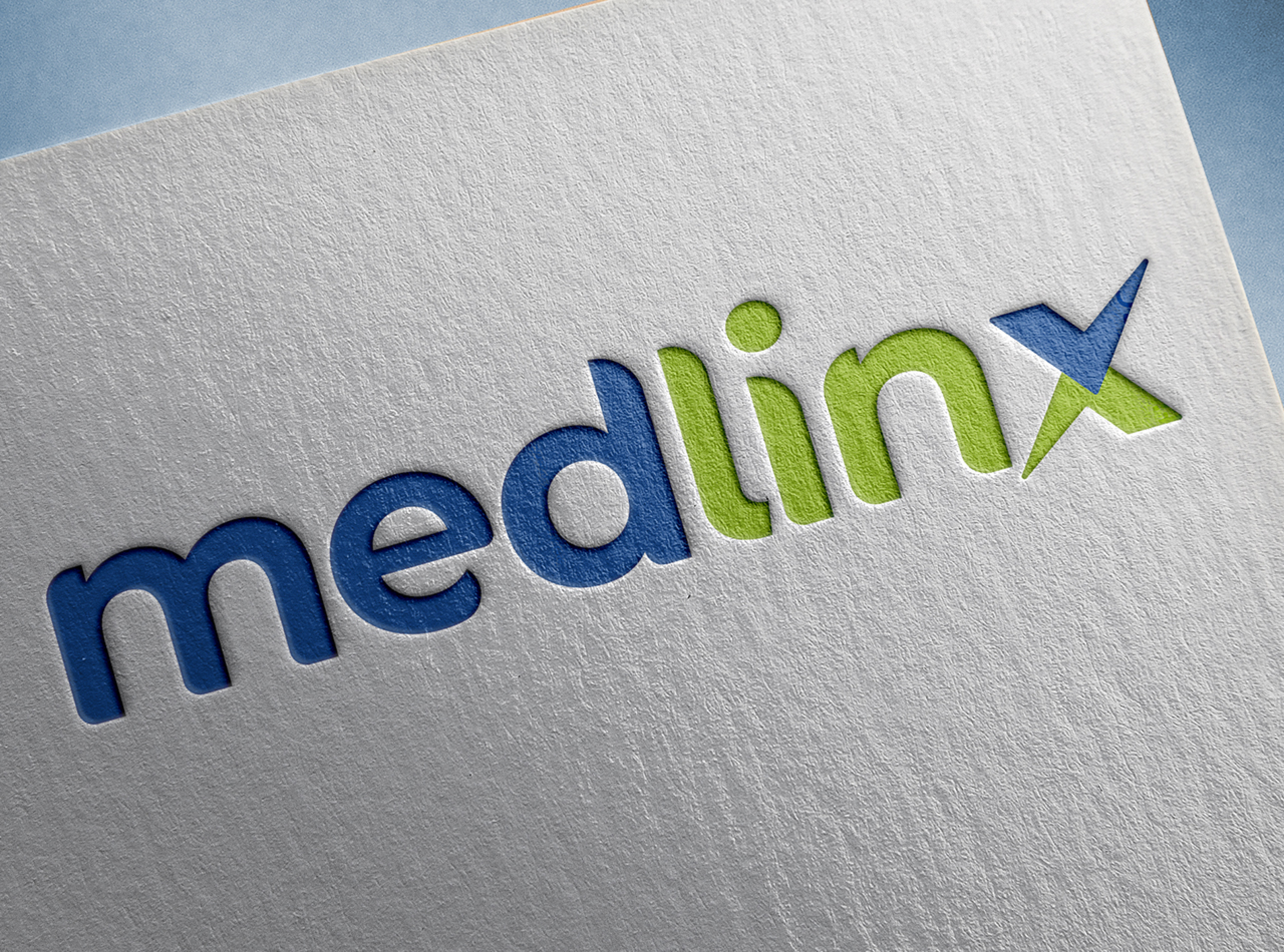
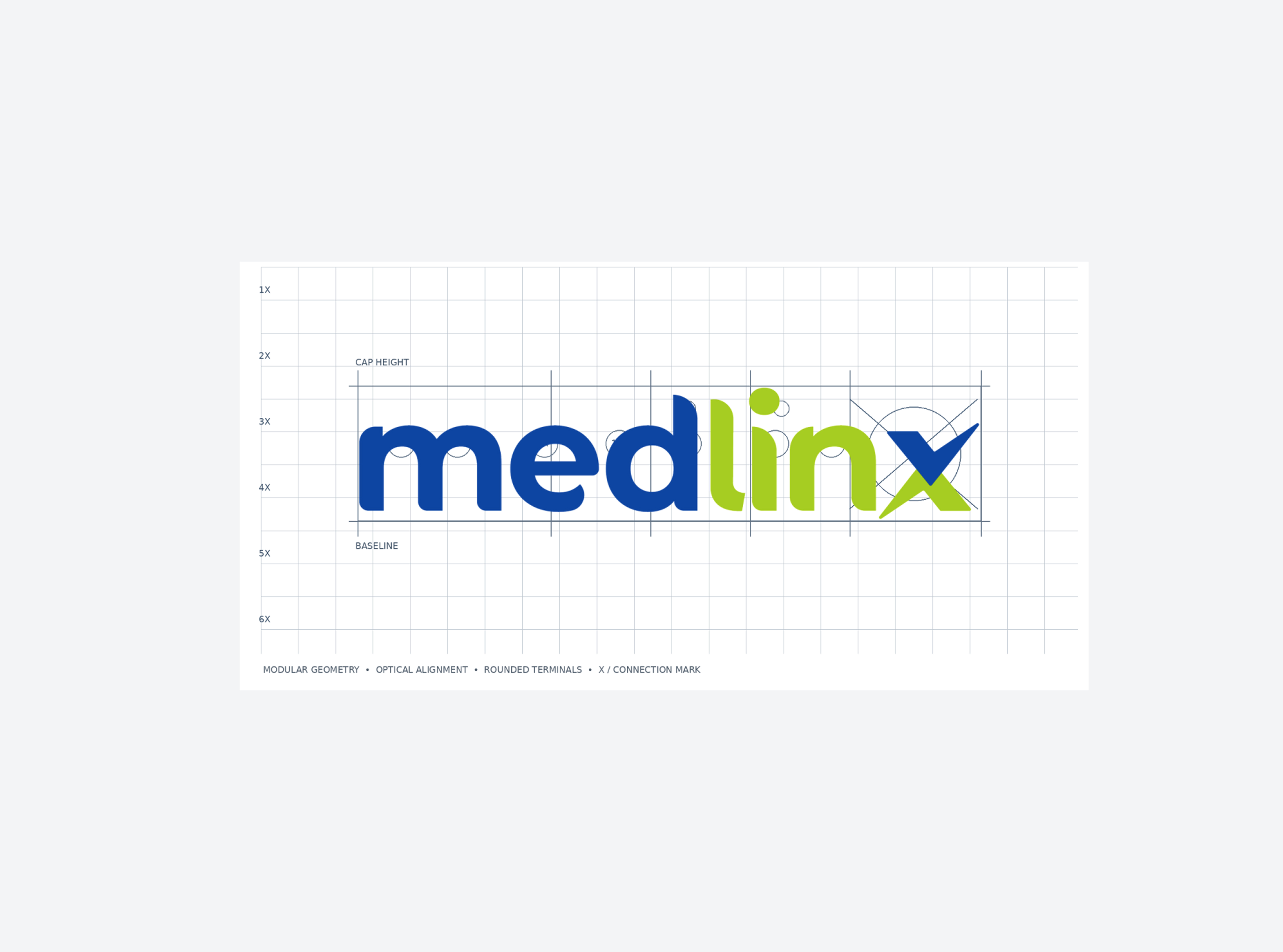
The wordmark is built on modular geometry with optical alignment and rounded terminals. The "x" doubles as a connection mark — a visual metaphor for linking stakeholders across the healthcare network. The dot above the "i" is positioned as a human element within the technical grid.

03 — Color Palette
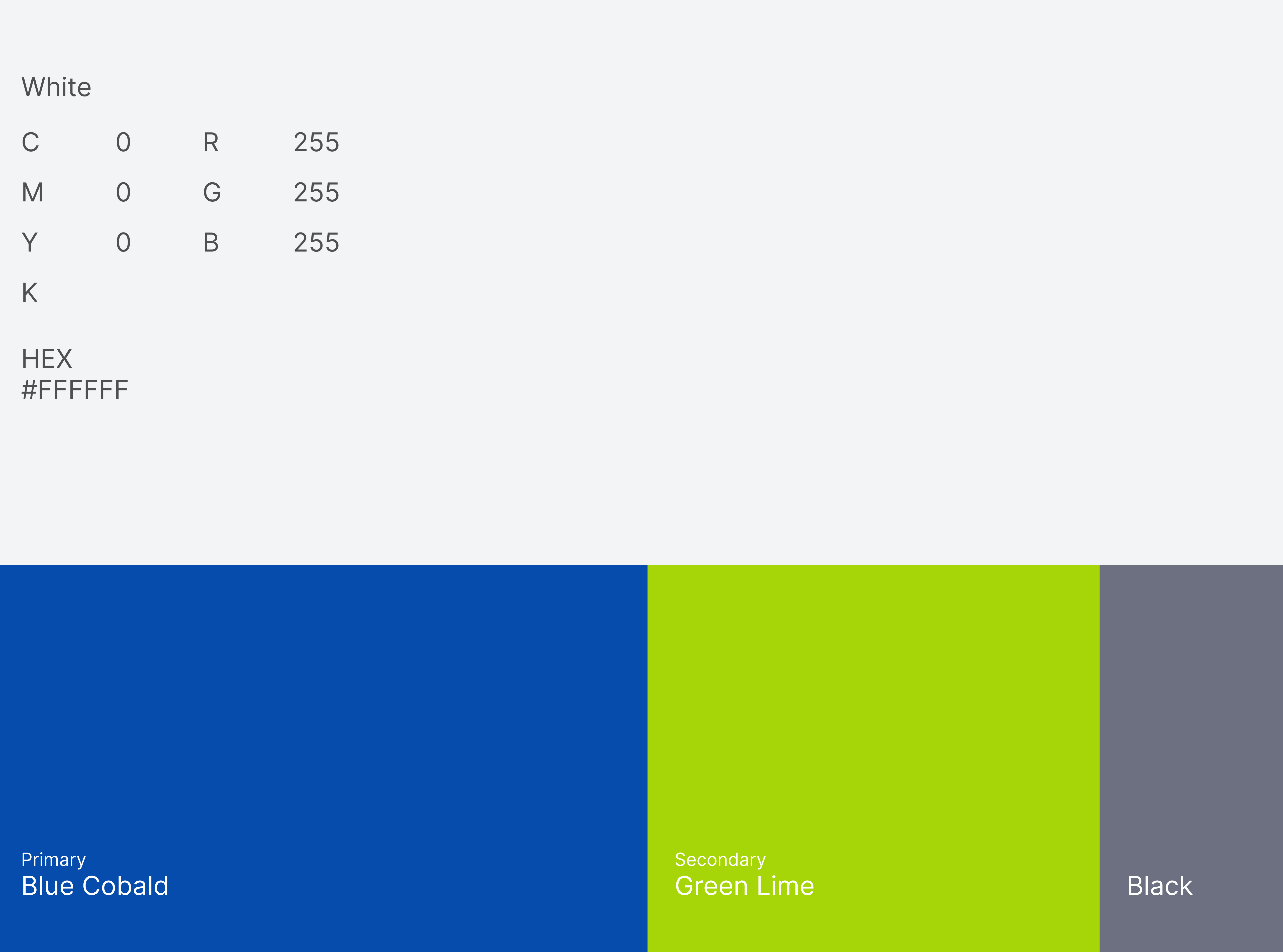
Blue Cobalt as the primary — conveying trust, reliability, and clinical precision. Green Lime as the secondary — bringing energy and the sense of health and growth. Together they create a palette that feels both medical and modern.
04 — Brand Collateral
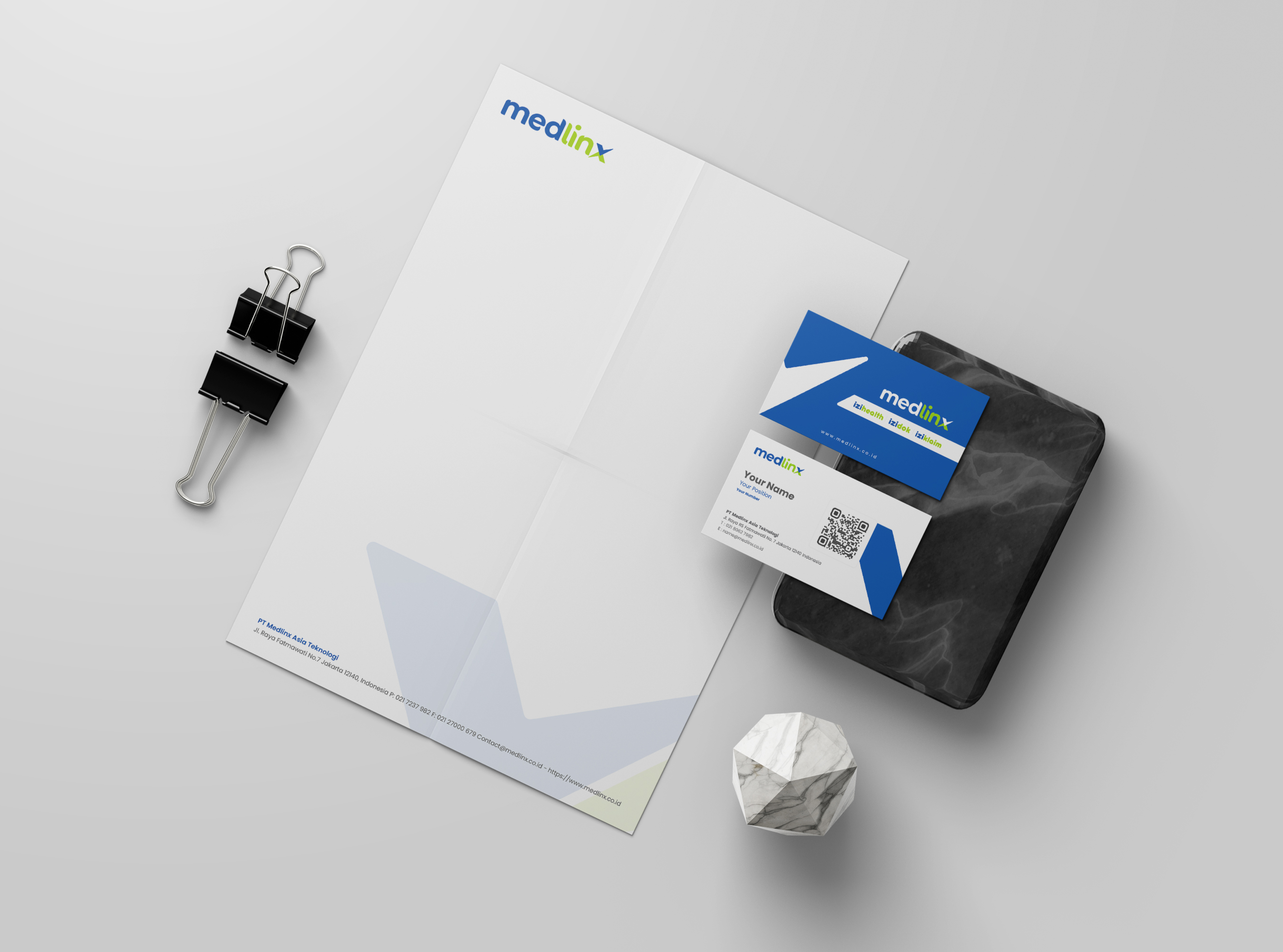
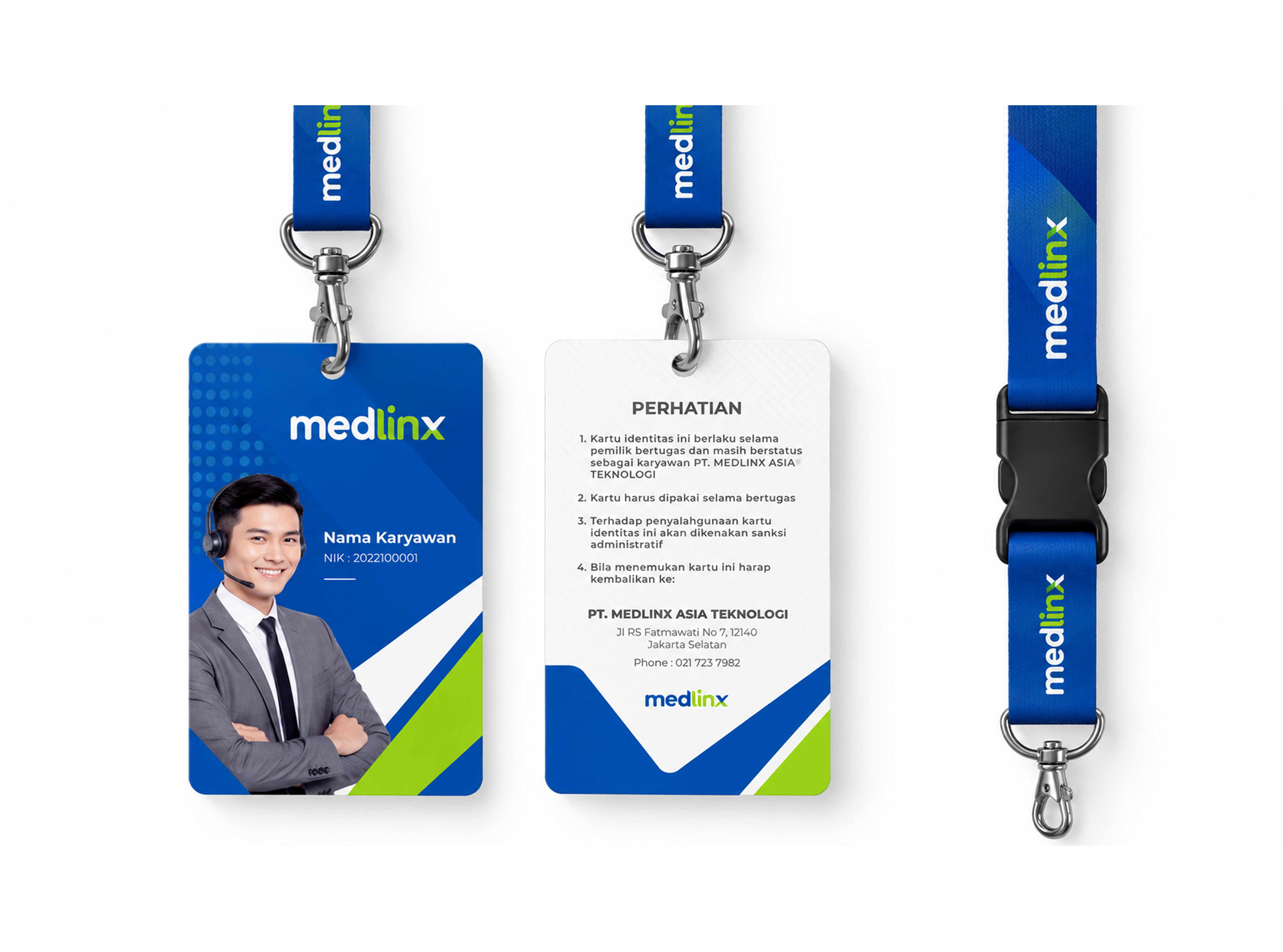
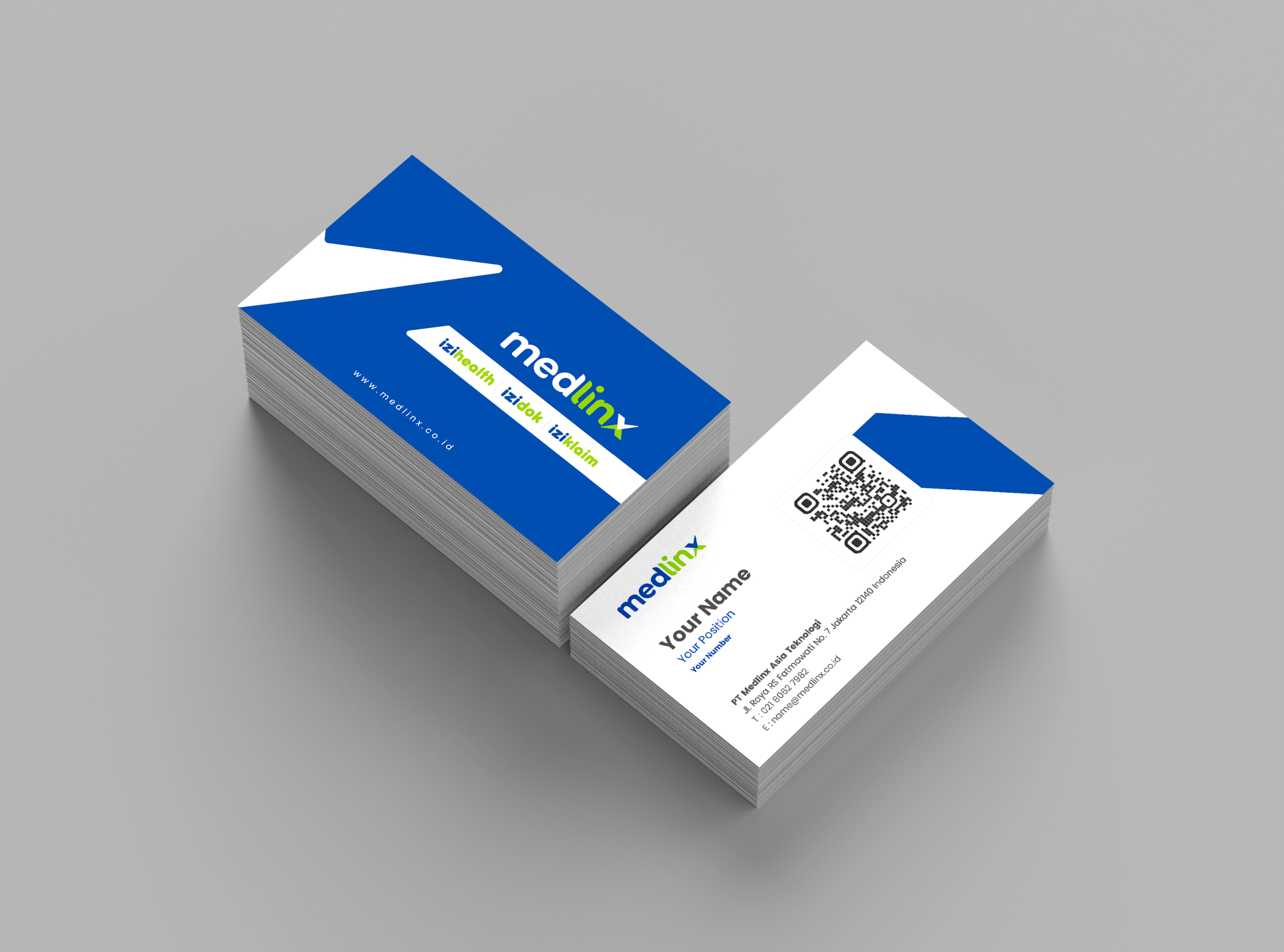
The identity applied to everyday corporate touchpoints — employee ID cards with lanyard, and business cards carrying the full Medlinx product suite on the back. Each piece is designed to reinforce the brand's professionalism at every interaction.
05 — Stationery
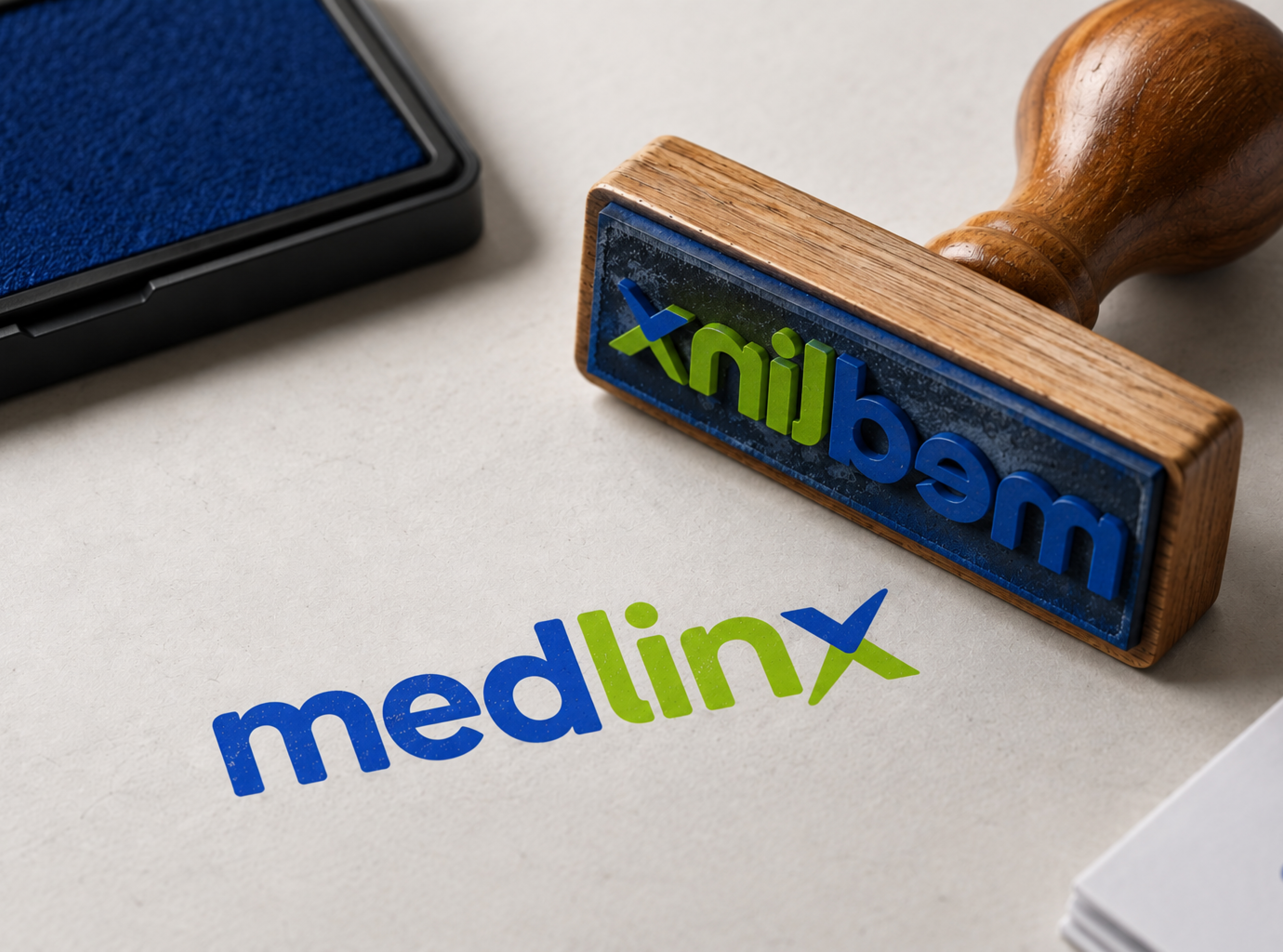
Letterhead, business card stationery set, and rubber stamp — completing the corporate identity system for day-to-day office use and official correspondence.